 By dylan
Your brand lives in a war for attention. Every day, consumers scroll past hundreds of visual messages. Most get ignored. A few stick. The difference isn’t luck. It’s biology.
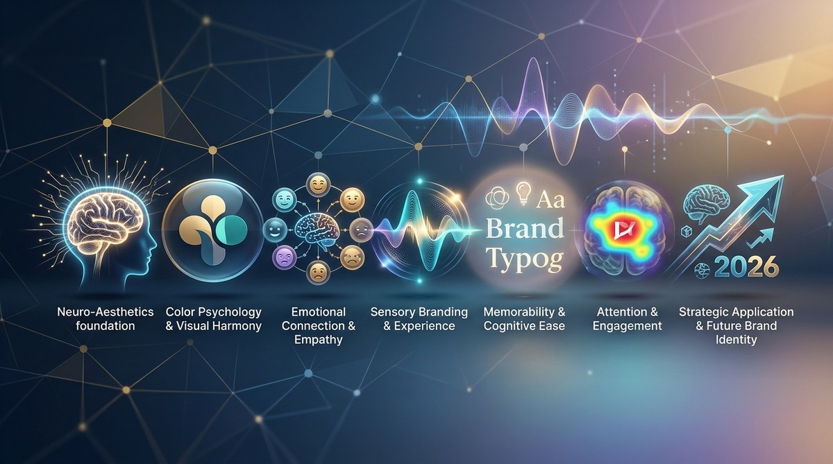
The most memorable brands in 2026 understand something their competitors don’t. They know the human brain is wired to respond to specific visual patterns, shapes, and colors. This is neuro-aesthetics. It is the science of how our brains process beauty, comfort, and trust through visual cues. When you apply neuro-aesthetics brand identity principles, you stop guessing what your audience likes. You start designing for how they think.
Neuro-aesthetics brand identity uses brain science to build brand recall, trust, and emotional connection. By applying principles like the golden ratio, color psychology, cognitive fluency, and symmetrical design, you can create a brand that feels instantly familiar and trustworthy. This guide gives you seven actionable ways to apply it in 2026.
The Brain Science Behind Your Logo
Before we get into the tactics, let’s talk about what happens inside a person’s head when they see your brand. The visual cortex processes images 60,000 times faster than text. Within 50 milliseconds, the brain has already formed an emotional judgment about what it sees. You don’t get a second chance at a first impression.
Neuro-aesthetics studies this process. Researchers like Semir Zeki at University College London have shown that the brain’s reward centers light up when we encounter symmetrical, balanced, and harmonious designs. The same areas activate when we eat good food or hear our favorite song. Your brand can trigger that same dopamine response.
This isn’t about making things “pretty.” It is about making things neurologically efficient. When a design is easy for the brain to process, it feels good. Psychologists call this “processing fluency.” High fluency equals positive feelings. Low fluency equals confusion and distrust.
7 Ways to Apply Neuro-Aesthetics Brand Identity in 2026
Here is a practical numbered list of seven methods you can implement starting today.
-
Use the golden ratio in your logo and layout. The golden ratio (approximately 1:1.618) appears throughout nature, from seashells to the human face. The brain recognizes this proportion as inherently balanced. Brands like Apple and Twitter have used it in their logo geometry. Audit your current logo. Does it fit inside a golden rectangle? If not, consider a subtle redesign.
-
Choose colors based on biological response, not trends. Color psychology is real, but it is deeper than “blue means trust.” The brain evolved to associate certain colors with survival. Green signals safety and food. Red signals urgency and importance. Blue signals stability and openness. In 2026, use a palette of no more than three colors to reduce cognitive load. More than three forces the brain to work harder.
-
Apply the peak-end rule to every brand interaction. The brain remembers experiences based on the most intense moment (the peak) and the final moment (the end). It does not average the experience. Map your customer journey. Find the peak moments and make them visually striking. Make the end of every interaction feel resolved and satisfying. A checkout page with a calming gradient and a simple thank you message works better than a cluttered confirmation screen.
-
Design for symmetry and balance. The human brain has a strong preference for symmetry. It signals health and order. Asymmetry can be interesting, but it requires more mental effort. For your primary brand assets (logo, hero images, landing pages), lean toward symmetrical layouts. Save asymmetry for secondary assets where you want to draw attention to a specific element.
-
Use curved shapes over sharp angles. Research from the University of Toronto shows that people consistently prefer curved objects over angular ones. Curves feel safer. Sharp angles can trigger the amygdala, the brain’s threat detector. This is why car dashboards and medical devices use rounded edges. Apply this to your UI elements, packaging, and even typography. A rounded button gets more clicks than a sharp rectangle.
-
Create visual contrast to guide the eye. The brain is a pattern-seeking machine. It scans for differences. Use contrast (not just color contrast, but size, shape, and texture contrast) to direct attention to your most important message. A call to action button that is 20% larger than any other element on the page will be seen first. The brain cannot help it.
-
Reduce visual noise for cognitive fluency. Every extra element on a page costs mental energy. Remove anything that does not serve a clear purpose. White space is not wasted space. It is processing space. Brands like Google and Muji have built entire identities around this principle. In 2026, minimalism is not a style choice. It is a neurological necessity.
Common Mistakes That Hurt Brand Recall
Even well intentioned brands make errors that reduce their neuro-aesthetic effectiveness. Here are the most common ones.
- Using too many fonts. Each font switch forces the brain to reorient. Stick to one or two font families.
- Ignoring the power of symmetry. An off center logo or misaligned grid creates subconscious tension.
- Forgetting about texture. Digital brands often ignore tactile cues. Use subtle textures or gradients to add depth.
- Overusing high contrast. Black text on white is fine for body copy, but for backgrounds, use softer contrasts to avoid visual fatigue.
- Neglecting the negative space. The space around your logo is as important as the logo itself. The FedEx arrow is a classic example.
The Neuro-Aesthetics Brand Identity Checklist
Use this table as a reference when reviewing your brand assets. It compares the right technique with the wrong approach.
| Principle | Right Technique | Wrong Technique |
|---|---|---|
| Symmetry | Balanced logo, centered hero image | Off center elements, lopsided layouts |
| Color palette | 2 to 3 colors, high harmony | 6+ colors, clashing hues |
| Typography | One serif + one sans serif | Five different fonts in one page |
| Curvature | Rounded buttons, soft icons | Sharp corners, jagged shapes |
| Contrast | One bold CTA, rest muted | Everything the same size and color |
| White space | 40%+ empty space on landing page | Dense text, no breathing room |
| Peak-end design | Strong visual peak + calm exit | Flat experience, abrupt ending |
“The most beautiful designs are not the most complex. They are the most neurologically efficient. When the brain does not have to work hard to understand what it sees, it rewards you with trust.” — Dr. Colin Ware, visual perception researcher
Why This Matters More in 2026
The digital landscape is getting louder. AI generated content is flooding feeds. Consumers are developing banner blindness at an alarming rate. In this environment, your brand cannot afford to be average.
Neuro-aesthetics gives you a scientific edge. It does not rely on trends that shift every season. It relies on how the human brain has worked for thousands of years. That stability is your advantage. While competitors chase the next design fad, you can build a brand identity that feels right on a primal level.
For a deeper look at how to build a brand that stands out, read our guide on mastering brand differentiation in a crowded digital space. It pairs well with the principles we covered here.
A Simple Process to Audit Your Current Brand
You do not need a full redesign to start using neuro-aesthetics. Follow this process over a week.
- Take screenshots of your top five brand touchpoints (homepage, product page, email, social profile, packaging).
- Remove color and look at the grayscale versions. Does the layout still guide the eye? If not, your contrast needs work.
- Check symmetry. Use a ruler tool or a symmetry plugin. Are your elements balanced?
- Count your fonts. If you have more than two, pick the weakest one and remove it.
- Measure your white space. If text covers more than 60% of the page, start editing.
- Run a color harmony test. Use a tool like Adobe Color to check if your palette is complementary.
- Get feedback from someone outside your industry. Ask them what they feel when they see your brand. Their gut reaction is closer to the brain’s real response than your own analysis.
Integrating Neuro-Aesthetics Into Your Broader Strategy
Neuro-aesthetics is not a standalone tactic. It works best when combined with a strong brand strategy. If you are building a new brand or refreshing an existing one, start with your brand purpose and positioning. Then layer the visual principles on top.
Read our guide on how to build a brand strategy that cuts through the noise in 2026 for a complete framework. The visual principles we covered here will amplify whatever strategy you choose.
Also consider how emotional branding is your most underused strategy in 2026. Neuro-aesthetics is the vehicle for that emotion. When the brain processes your design easily, it feels good. That feeling gets attached to your brand.
The Future of Brand Identity Is Invisible
The best neuro-aesthetic design is the kind people do not notice. They just feel calm, interested, or trusting. They cannot tell you why. The design disappears, and the message stays.
In 2026, the brands that win will be the ones that respect the brain’s limits. They will not ask consumers to work hard to understand them. They will make every interaction effortless. That is the power of neuro-aesthetics brand identity.
Start Small, See Big Results
You do not need a massive budget to apply these principles. Start with one touchpoint. Maybe it is your email newsletter or your landing page. Apply the peak-end rule. Add more white space. Reduce your font count. Test the results.
Measure your bounce rate, time on page, and conversion rate. The numbers will tell you if your neuro-aesthetic changes are working. In our experience running campaigns for brands in the luxury and tech sectors, even a 10% improvement in cognitive fluency can lift conversion by 15 to 25 percent.
Give it a try this week. Your audience’s brain will thank you.